The cosmic
embrace

Sometimes the best ideas come when you least expect them. This one hit me in the grocery store, of all places.
I was walking past an aisle of religious candles when I was suddenly transported back to my childhood—those candles were everywhere in my family's home, and God help you if you knocked one over while roughhousing with cousins.

Then, for reasons I still can't explain, a question popped into my head:
'What if the story was wrong?'
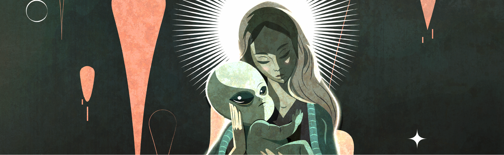
What if baby was actually... an alien?

The idea wouldn't let go. So when I got home, I grabbed my stylus and started experimenting.
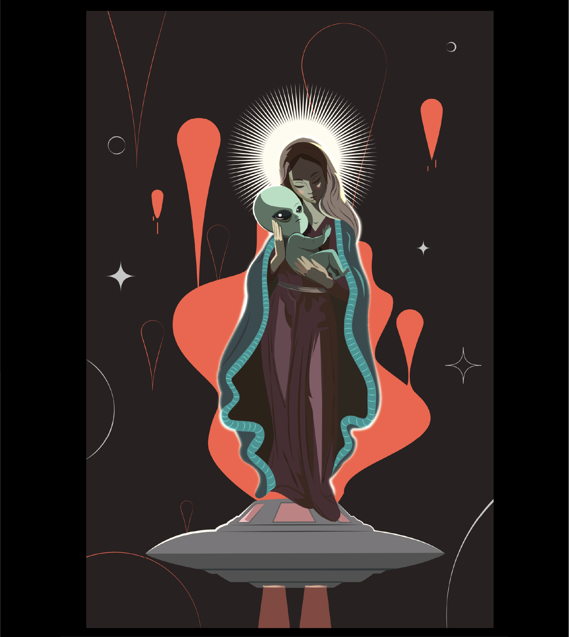
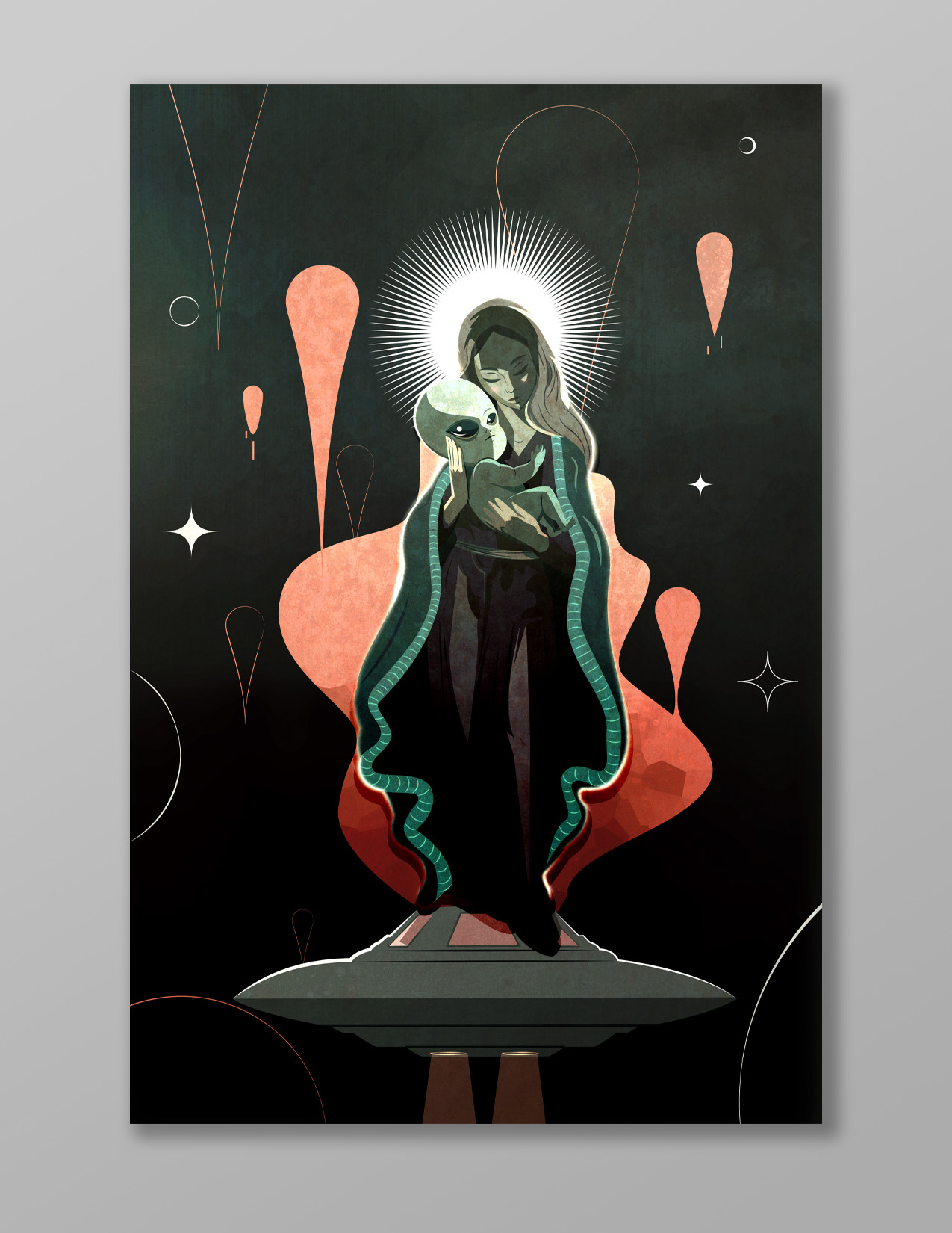
Here is what came out of it.
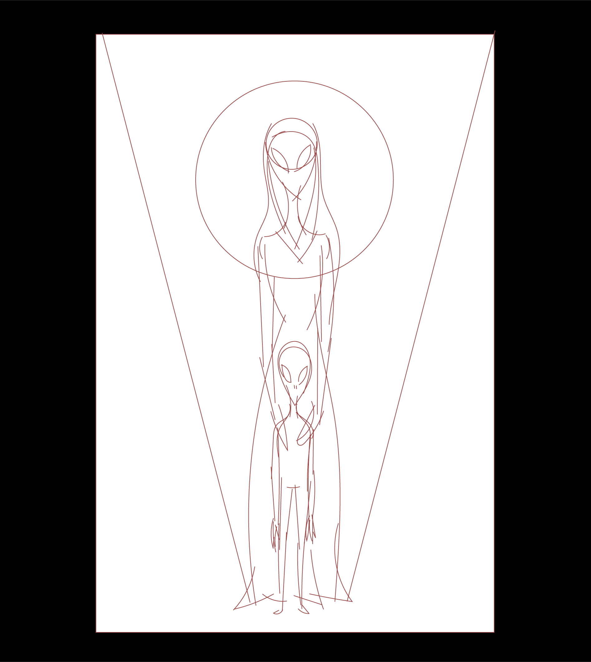
It always starts with an idea. From there, I move to sketching—playing with composition, figuring out the story I want to tell.

When I sketch, I almost always reach for the pencil tool within Adobe Illustrator. I love that simple, thin stroke—it forces me to be cleaner and more intentional than I would be with other digital tools.

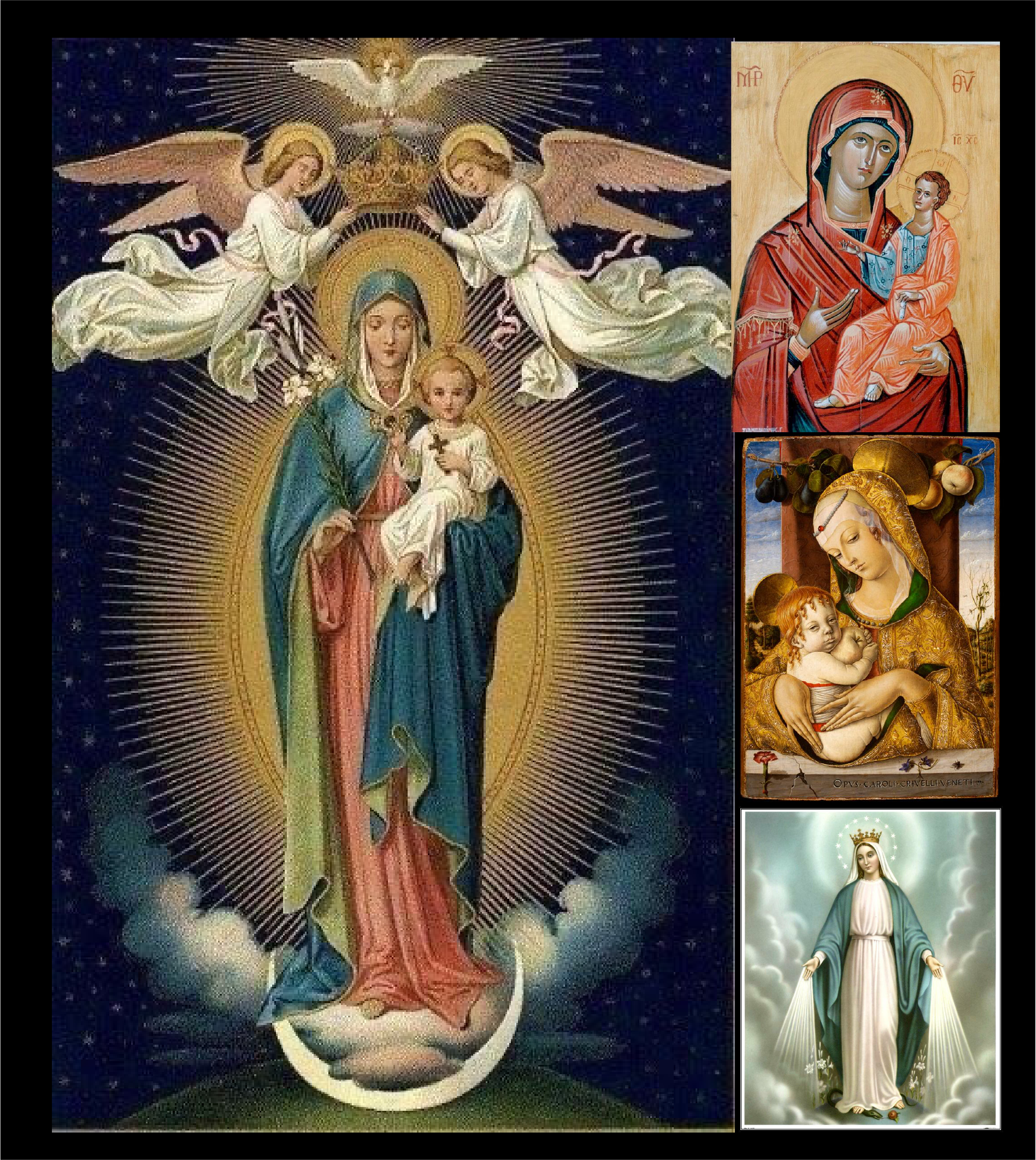
My first sketch was pretty much exactly what had popped into my head at the grocery store. But it was missing that old-school Renaissance vibe I was hoping for, so I hit the internet for some reference images.

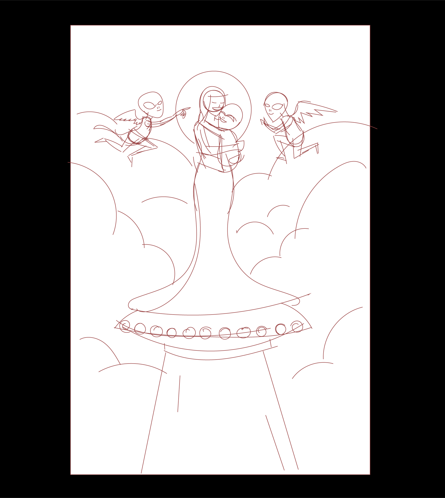
With those on my canvas, I moved to the second sketch (sketch 02). It had some of the missing elements, but it still didn't quite click for me.

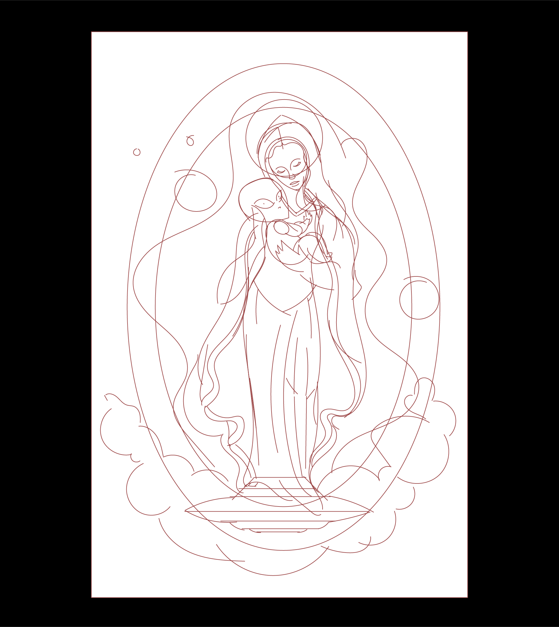
The third sketch was more traditional—a classic image of Mary and baby. I took what I loved from the second sketch—her standing on a UFO, those dramatic clouds—and brought them into the third.

That was the one. The one I knew I had to push further.
sketch 01
sketch 02
sketch 03
References
With the sketch finalized, I did something I don't usually do—I dove into color early.
Normally, I save that for later in the process, but this time I wanted to find the right mood from the start.

I noticed that many of the Renaissance visuals I had researched were rich with reds, yellows, blues, and greens—so I decided to follow that palette.
With my sketch locked on the layer above, I started building vector shapes. I rely on basic forms—squares, circles, ellipses—and pull points where I need them.
My rule of thumb? Use as few points as possible. The fewer vertices a shape has, the cleaner and more controllable it is.
Those bezier handles are magic—they help me create smooth, fluid curves with ease.

I also build my shapes in separate pieces. Even though I know this won't be animated, working this way gives me extra control when adjusting placement.
The sketch is never set in stone—I often find myself refining the original composition as I render the final shapes.
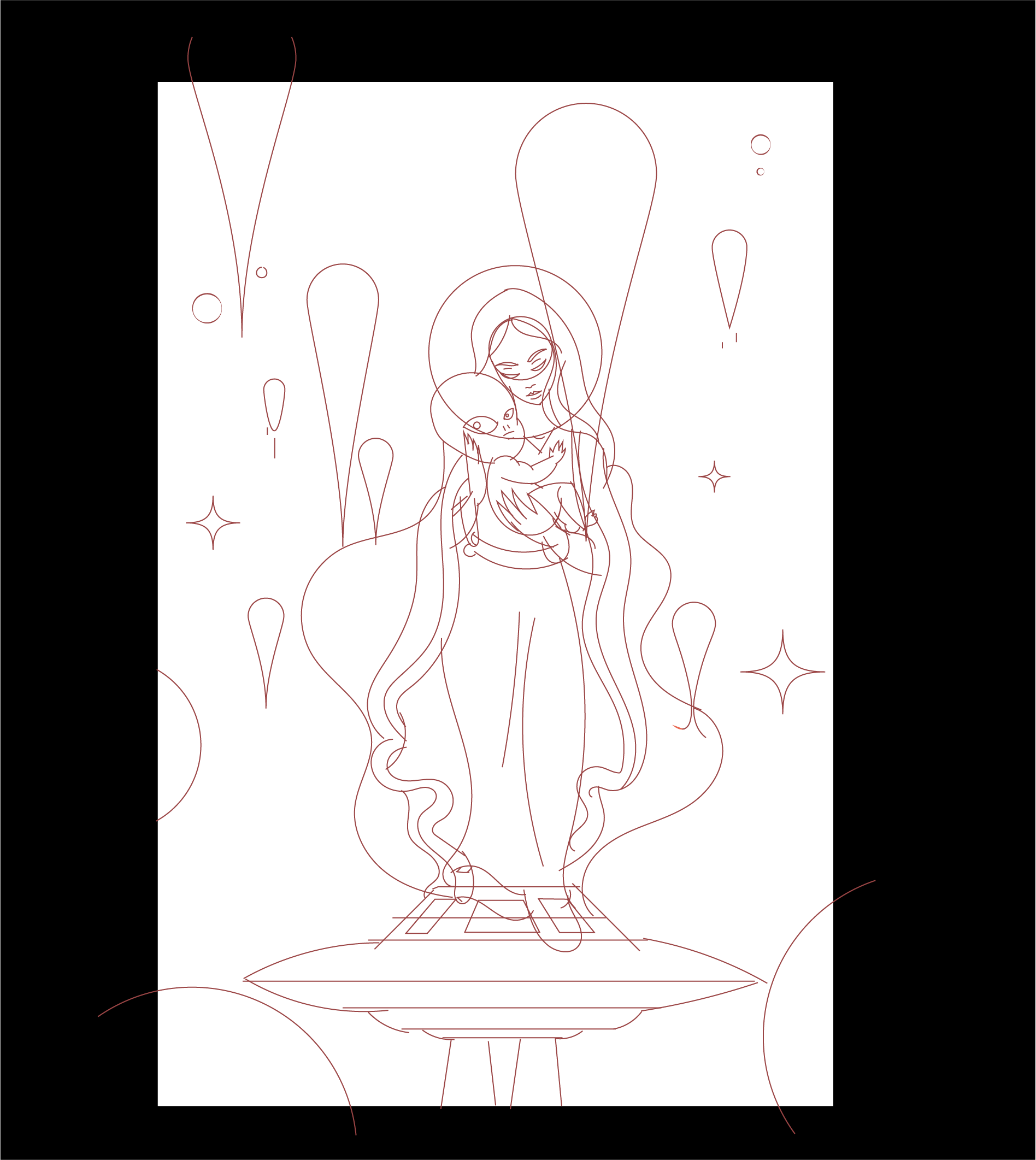
Clean up sketch
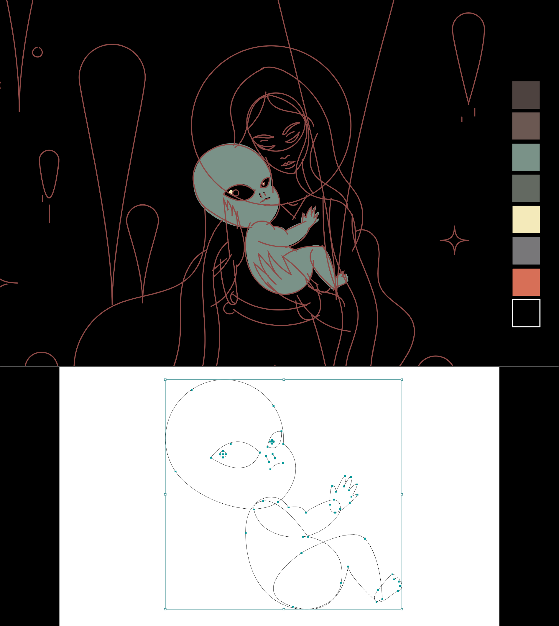
coloring & Shape building in adobe illustrator

Vector FLat colors to import into photoshop
applying textures within various shape elements
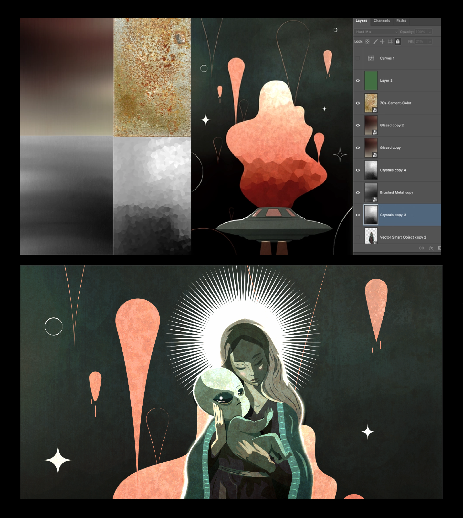
For this piece, I wanted to experiment with textures—so I rendered all the vector shapes as flat colors and brought each one into Photoshop as a Smart Vector.
This preserved their crispness while giving me the flexibility to play.

With everything imported and placed, I started digging through my texture library.
I began with the blob shape. The crystal texture caught my eye—its dark-to-light gradient felt like a perfect match for it.
After experimenting with different layer styles, I landed I liked, and contined with the rest of the elements.

This part isn't a science—it's more like playing until it feels right. And sometimes, that is exactly where the magic happens.

Let’s Connect And Let’s Work Together

Let’s Connect And Let’s Work Together

Let’s Connect And Let’s Work Together

Let’s Connect And Let’s Work Together

Let’s Collaborate

Let’s Collaborate